About Me

My photo
As a little girl I would make dresses out of pillow cases and colour them with crayola markers, spend hours scribbling shoes and dreamed of working in the fashion industry, not much has changed since then. Im studying at Limerick School of Art and Design which I love,in my third year of fashion design. My favourite designers at the moment are Haider Rick Owens, Hussein Chalayan,Iris Van Herpen,Stella McCartney,Steffie Christaens , Gareth Pugh and Anne Sophie Madsen (and the list goes on and on and on!). I am driven and excited about fashion and look forward to the future.

Wednesday, June 27, 2012

Living in The Clouds!


Ever looked out of an airplane and wondered what it would be like to live in the clouds???
Well I hope this answers your questions : )

Monday, June 25, 2012

Yayoi Kusama


Born 22 March 1929. Yayoi Kusama is a Japanese writer and artist.Kusama is regarded as one of the most important living artists to come out of Japan and an important voice of the avant-garde. Throughout her career she has worked with a vareity of mediums including painting, collage, sculpture, performance art and environmental installations, most of which exhibit her interest in psychedelic colours,repition and pattern.
I love the craziness of her work. When looking at her work I can tell she had lots of fun in the process.
Recently she collaborated with Louis Vuitton and successfully brought a well needed injection of dot filled playfulness.  


Why I love her work...


Thursday, June 21, 2012

When Muted Met Bright.

The aim of this project was to get a better understanding of colour. Each student had to choose 2 contrasting words at random, I choose muted and bright. I had to look for colour stories that communicated each word and extract colours from each picture using as much different media as possible eg. markers, paper, make-up etc.After exploring each word through colour I had to mix the different themes and come up with 2 new colour stories.


Muted
Tearing cotton wool, cord and sugar paper to create soft muted tones.

Tracing paper gives the page a muted look.

Using an old holiday photo as a colour story. Here I choose organza for a delicate feel.

Different media creates an interesting version of this colour story.

Magazine pulls, fabrics and paper.


Bright
I chooses acid brights.

Extracting colours from magazine pulls.

Using old shopping bags for colour stories.

Looking at how artist/ photographer David LaChapelle uses colour.

Yayoi Kusama colourful work.


Colour Story 1
Colour story 1. Muted with a hint of bright.

Colour Story 2
Colour story 2. Bright with a hint of muted.
   

Monday, June 18, 2012

Dover Street Project / Rick Owens For Zara A/W 12

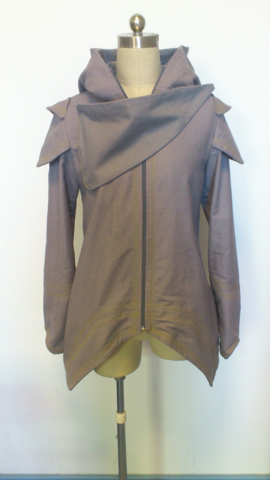
This project required me to research a designer while in London and then create a collection for a high street store, I choose Rick Owens for Zara.
 Rick Owens has always been one of my favorite designers. The brand is edgy and innovative. The colour pallet is always muted and your always guaranteed to see some leather or fur. When I think of a Rick Owens collection I think of layered clothes,clever detailing and an interesting mix of fabrics.
Zara in my opinion is one of the best high street stores there is. The quality is impeccable and the standard is high. Zara only stock a small number of each of the same garment and never get the same item in again, it encourages the customer to impulse buy as they know it might be gone the next time they visit the store. The prices in Zara are also very reasonable.
For this project I had to constantly think about who my customer was, how much did they earn and what did they need from their clothes. When choosing fabrics for the collection I had to always think of the price point, expensive fabrics were left as trims or used sparingly to keep the costs down.

Looking @ Rick Owens S/S 12

Looking @ details. Rick Owens signature neckline.

Thinking of fabric and swatching.

Zara S/S 12

Zara's muted colour palette for S/S 12

Zara TRF 

Inspiration for the collection came from my trip to London. The graffitti on streets provided the urban feel I was looking for. A visit to The National History Museum also gave me ideas for swatches.

Working on the stand in paper.

Mixing fabric and paper, playing with silhouettes.


Working on the stand and then drawing from the stand.

Using Collage.

Constantly looking back @ previous collections.

Here I cut shapes from the car out of fabric and placed them on the body.


Greta Constantine. Here the design duo used seat belts to make a collection.
I went to a scrapyard to get loads of seat belts, I ripped them, shredded them
and knitted with them. I came up with a new texture and it is in the collection.

The collection was mainly jackets and trousers.

The collection. 

Fabric Bord. Colours do not represent the collection.

Mood Bord.

The jacket I made. I choose to use bias binding on the inside as I thought
it would resemble the inside of a car door or under a bonnet. Top
stitching featured heavily in the collection inspired by the upholstery
in the cars I looked at. The hood added a casual and urban element.
Rick Owens signature detail is the flap across the neckline and I tried
to replicate that here.
 

Front.

Side.

Back.

Inside.